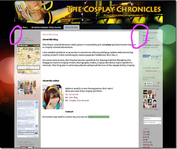
NEW LAYOUT WHEE!
After many long weeks of battling with codes, procrastination and waiting for the perfect picture, The Cosplay Chronicles’s 3rd layout is finally out! Do you guys like it xD?
And the Linkwithin functions are finally working again. Weirdly, it wasn’t showing for me in the previous layout. Does it work for you guys now? Comment and let me know>.<
I can’t help seeing the jarringly obvious amateur work here (I did this myself) after experiencing Min’s awesome and professional design for my last layout. But I really wanted to use the new page function so I had to change the layout. Apparently, you can still use the page functions with customised template but I really liked the tabs function here so X_X…
BTW does anyone know how to make the bg colour of the unselected tabs translucent white? Its now black and I don’t think it looks very obvious=_=
One of the biggest reason why this layout took me so long was because of the intense battle with the stupid codes! I managed to stretch the width to around 1000px but the annoying margins by the sides are still too fat. Anyone know what codes I should amend to make it narrower?
Still gotta add codes to allow for post summaries. I vaguely remembered blogger used to allow that function when you blogged via their WYSIWYG editor but I can’t seem to find it now D:


Comments
Nice work all the same!